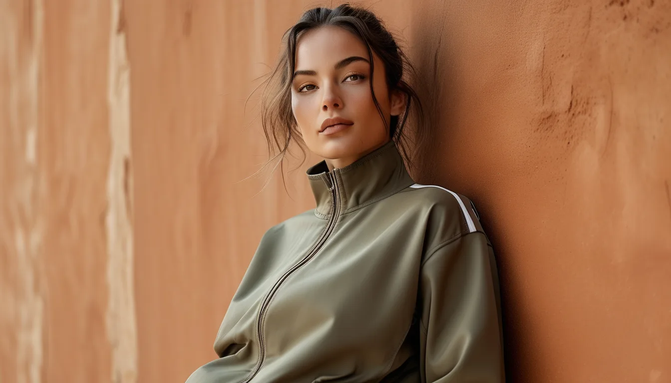
Earth Tone Activewear for the First Weeks of September
Quick Answer: Early September is the one stretch where warm mid-tones outperform both ends of the palette - bright summer brights suddenly read as out of season, while deep autumn browns and rusts look like you are rushing it. The colors that work now sit in the middle: clay, olive, sand, warm taupe, and muted terracotta. Pair them with the black or navy you already own rather than buying a whole new palette.
You open the drawer and everything is either too bright for the light outside or too heavy for a 78-degree afternoon.
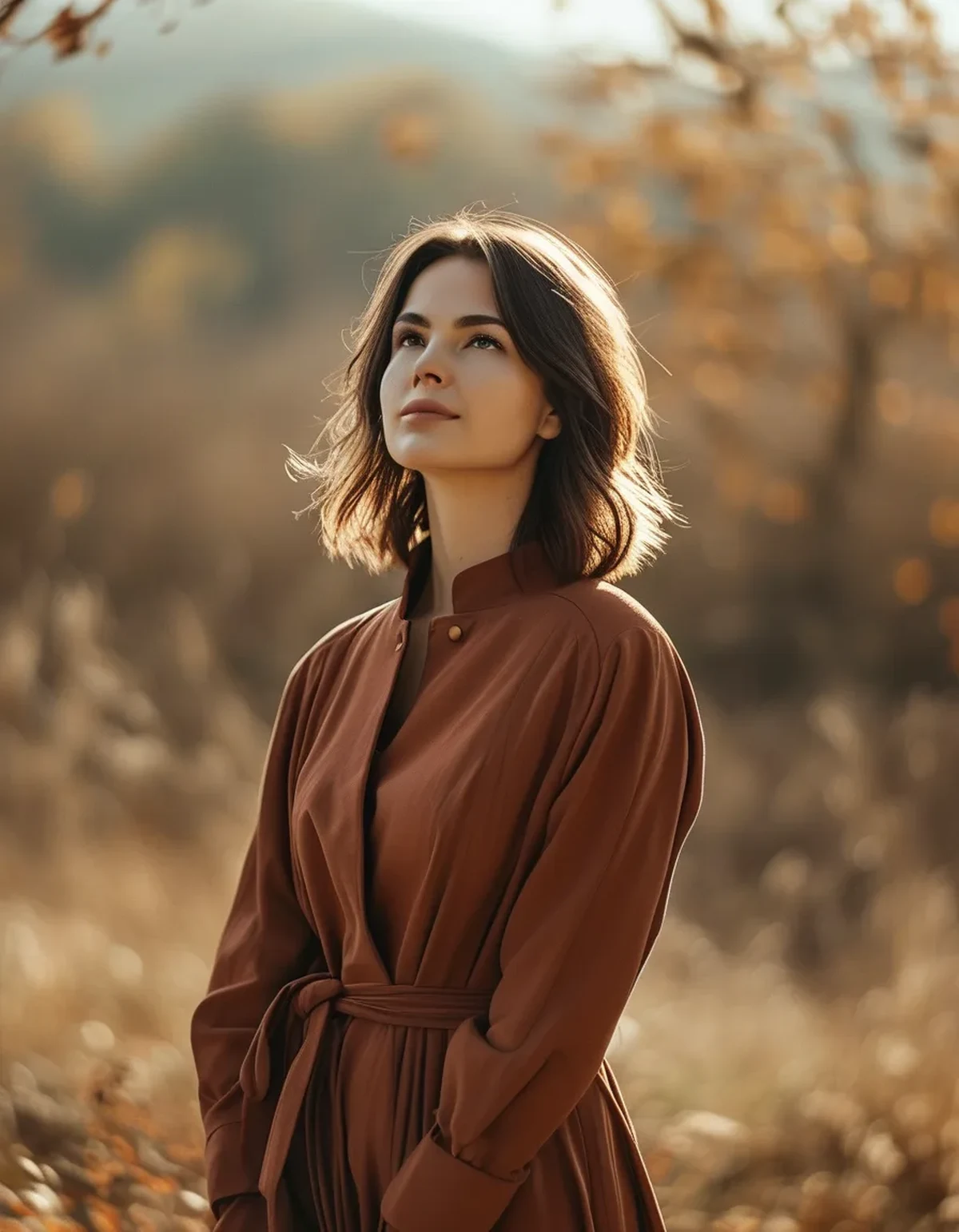
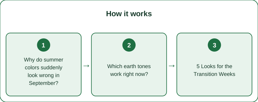
Why do summer colors suddenly look wrong in September?
Because the light changes before the temperature does, and your eye notices it immediately even when you cannot name what changed.
The sun sits lower. Lower sun angle means light travels through more atmosphere, which warms and softens it. Colors that were designed to work under high, hard summer light look flat and slightly harsh under it. Bright neons and cool pastels are the most affected.
Contrast drops. Softer light means less contrast in the environment overall, and high-saturation clothing that looked balanced in July now looks louder than everything around it.
Your context changes. Backgrounds shift - grass dries out, leaves start turning, and the general environment moves warmer. Warm mid-tones harmonize with that; cool brights fight it.
But the temperature has not moved much. This is the entire problem. Afternoons still hit the high 70s or low 80s, so heavy fabrics and deep autumnal colors are visually right and physically wrong. The seasonal signal in early September is a color problem, not a weight problem, and that is where most people get it backwards.
Which earth tones work right now?
The middle of the range, specifically. Both extremes are wrong for a few more weeks.
Clay and terracotta, muted rather than saturated. The single most seasonally correct color of the moment. Warm enough to signal the turn, light enough not to look like October.
Olive, on the lighter side. Deep forest and army green are genuinely autumnal and can wait. A lighter, grayed olive works now and keeps working through the whole transition.
Sand, oat, and warm taupe. These carry over directly from summer and simply read differently in warmer light. If you buy one transitional piece, make it a warm neutral bottom - it works with the entire summer wardrobe and the entire fall one.
Muted rust, sparingly. Right at the edge. Works now as an accent, becomes a main color in three weeks.
What to hold off on: chocolate brown, deep burgundy, mustard, and anything approaching a true autumn saturation. They will look right soon and look like trying too hard now.
And what to retire: neon, cool pastels, and bright white sets. Not because of any rule, but because they genuinely photograph and read as out of step under this light.
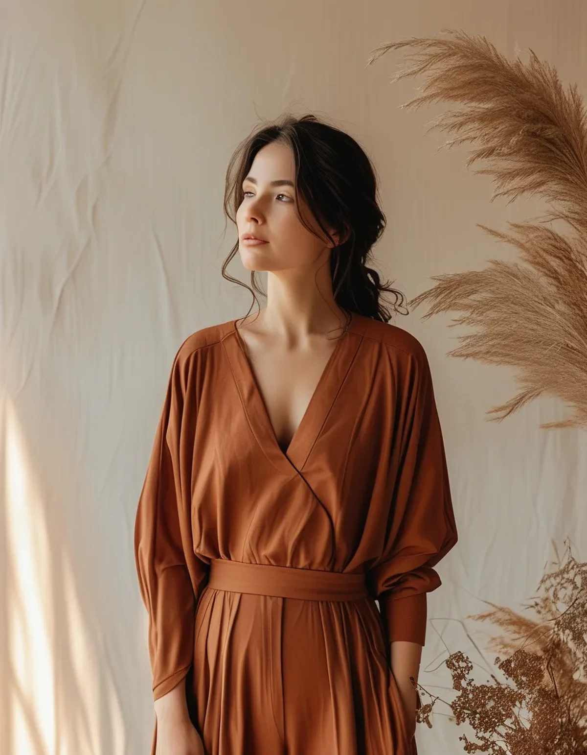
5 Looks for the Transition Weeks
Look 1: Clay and black. Clay legging with a black cropped top and a black light jacket. Black is the most underrated transitional partner for earth tones because it grounds a warm color without adding seasonal weight. Works at 78 degrees and at 62.
Look 2: Sand on sand, broken with navy. Sand-toned set with a navy layer and white sneakers. A monochrome warm neutral reads expensive and quiet, and the navy stops it from looking washed out under soft light.
Look 3: Olive with cream. Light olive bottom, cream long-sleeve top. This is the most versatile daytime combination of the season - errands, walking, a class, and it looks entirely intentional in each.
Look 4: Terracotta with warm gray. Muted terracotta top, warm gray legging, and a light layer in either color. Warm gray works where cool gray does not right now - the undertone is what makes the difference, and it is worth checking on anything gray you already own.
Look 5: Taupe and denim. Taupe activewear top with a denim-look bottom and a light knit over the shoulders. The most transitional look on the list, and the one that goes furthest outside the gym.
Myth vs Fact: transitional color
Myth: You need a separate fall wardrobe.
Fact: You need three or four warm mid-tone pieces that bridge both. The transition period is roughly six weeks long, and buying a full palette for it is the most reliable way to own things you wear briefly and then not at all.
Myth: Earth tones are unflattering on cool undertones.
Fact: Undertone matching matters, but the range is wide enough for everyone. Cool undertones do better with grayed, muted earth tones - sage over olive, taupe over camel, dusty terracotta over orange-rust. Warm undertones can take the more saturated versions.
Myth: You should not mix earth tones with black.
Fact: Black is the most useful anchor available for this palette, and it is what most people already have the most of. The combination that genuinely does not work is warm earth tones with cool bright white - use cream or oat instead.
Myth: Darker colors are more flattering, so go deep.
Fact: Depth and flattery are not the same thing, and a deep autumn palette in late-summer light tends to read heavy rather than slimming. Mid-tones with good undertone matching do more.
Myth: You have to commit to one temperature of neutral.
Fact: Warm and cool neutrals coexist fine when one is clearly dominant. What looks unintentional is a 50-50 split - a cool gray top with a warm taupe bottom in equal visual weight.
FAQ: September Color Questions, Answered
What is the single best piece to buy for this stretch?
A warm neutral full-length legging in sand, taupe, or light olive. It partners with everything you already own in both directions, and it is the piece that gets worn most through the whole transition.
Do earth tones show sweat more?
Mid-tones generally show sweat marks more than very dark or very light colors. Textured fabrics and heathered finishes hide it considerably better than flat matte ones, which is worth knowing when choosing a clay or taupe piece for actual workouts.
How do earth tones photograph in gym lighting?
Better than most colors under warm indoor lighting, and less well under the cool fluorescent lighting some gyms use, where warm tones can look muddy. If your gym is fluorescent-lit, keep the earth tones for outdoor sessions and daylight.
When does the full autumn palette actually start working?
Roughly when daytime highs settle consistently below the mid-60s and the light stops being bright in the middle of the day - typically several weeks after the first cool mornings arrive. Let the light tell you rather than the calendar.
TL;DR:
- Early September is a light problem, not a temperature problem - the sun angle changes weeks before the weather does.
- Warm mid-tones win now: clay, light olive, sand, warm taupe, muted terracotta. Hold chocolate, burgundy, and mustard.
- Anchor with the black and navy you already own instead of buying a new palette for a six-week window.
- Cool undertones should reach for grayed versions - sage over olive, taupe over camel.
The frustration of this stretch is that nothing in the drawer looks quite right even though everything technically fits the weather. It is not the clothes. It is that the light has changed and the temperature has not, and a few warm mid-tone pieces resolve the mismatch for the whole six weeks.
See It in Motion
Seen here: High Waist 8” Yoga Shorts — shop similar styles on bubblelime.com
Keep Reading
This article is for general informational and styling purposes only. Fit, sizing, and product availability may vary.