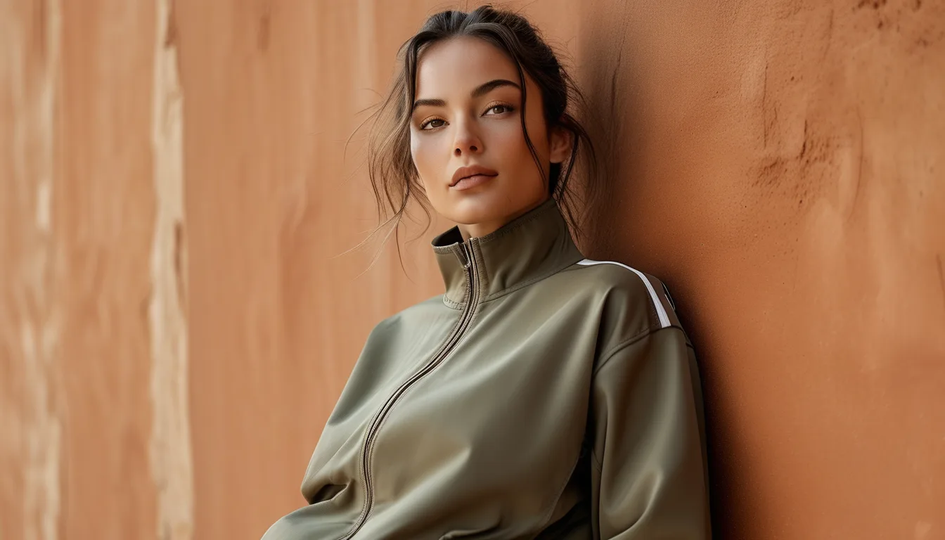
Earth Tone Activewear in Low Autumn Light: What Reads Flat and What Glows
Quick Answer: Autumn light is lower in intensity and warmer in color temperature, which flattens mid-tone earth colors and makes muted olives, taupes, and dusty browns read grey or muddy. What survives it: tones with a warm undertone and either high or low value - rust, terracotta, cream, deep chocolate. What struggles: mid-value cool-leaning neutrals like sage, stone, and dusty mauve. The fix is contrast, not brighter color.
The frustrating part is that nothing about the garment changed. The light did, and earth tones are the palette most sensitive to it.
What actually changes about autumn light?
Two properties shift at once and both work against muted colors.
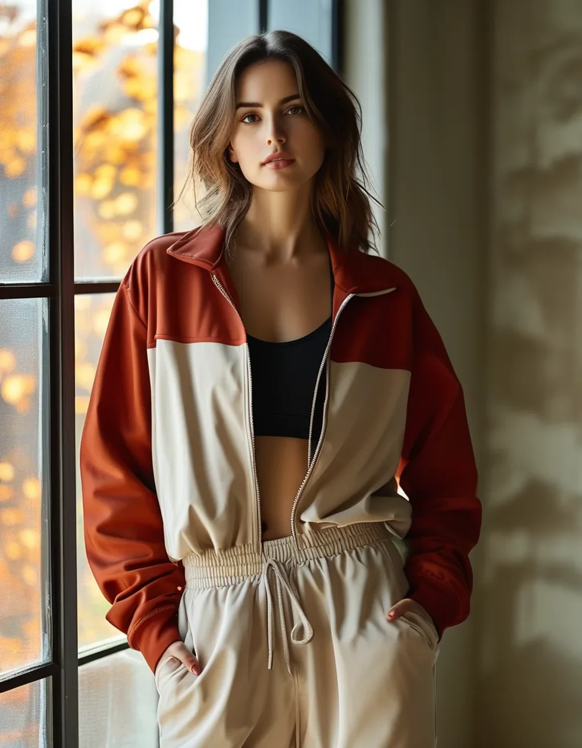
Intensity drops sharply. The sun sits lower, passes through more atmosphere, and daylight hours shorten. Overcast autumn days are dramatically dimmer than summer ones - and color saturation perception drops with light level. At low light levels, your cone cells contribute proportionally less, so colors genuinely appear less saturated and closer to grey. This is a property of your visual system, not the fabric.
Color temperature warms and then goes flat. Direct low autumn sun is very warm - golden hour lasts longer and is more golden. But overcast autumn skies are cool and diffuse, around 6500K or higher. So you get two opposite lighting conditions in the same week, and a color that glows in one can die in the other.
Indoor light takes over earlier. From October, a large share of your day is under artificial light, which is typically warm (2700-3000K) and has a limited spectrum. Colors that depend on subtle blue-green undertones - sage, stone grey, dusty teal - lose those undertones entirely under warm indoor light and collapse toward beige.
The practical consequence: mid-value colors are the most vulnerable, because they have neither the brightness to catch what light there is nor the depth to read as intentional darkness. They just become grey.
Which earth tones actually survive the season?
Hold up well:
- Rust, terracotta, brick. Warm undertone, mid-to-deep value, and enough chroma to stay legible when light drops. These are the workhorses of the autumn palette for good reason.
- Cream, ivory, oatmeal. High value means they reflect what light there is. In a dim room, cream reads as light rather than as an absence of color, and it lifts an entire outfit.
- Deep chocolate and espresso. Dark enough to read as deliberate depth rather than muddiness. Brown has replaced black as the sophisticated dark neutral for exactly this reason.
- Camel and tan. Warm and mid-high value, and they photograph beautifully in low golden light.
- Deep forest and olive at the dark end. A properly dark olive holds; a mid-tone one does not.
Struggle:
- Sage and mid-tone grey-green. The most popular activewear color of recent years and the most vulnerable. Its cool undertone disappears under warm indoor light, leaving it flat.
- Stone, greige, mushroom. Mid-value, low chroma, and cool-leaning. Under November overcast, these are nearly colorless.
- Dusty mauve and dusty blue. The dust in dusty colors is desaturation, which is precisely what low light adds more of.
The pattern: warm undertone plus a value that is clearly light or clearly dark. Mid-value and cool-leaning is the combination that dies.
What Nobody Tells You About Fabric Finish and Light
Two garments in the exact same dye lot can read completely differently, and the reason is surface, not color.
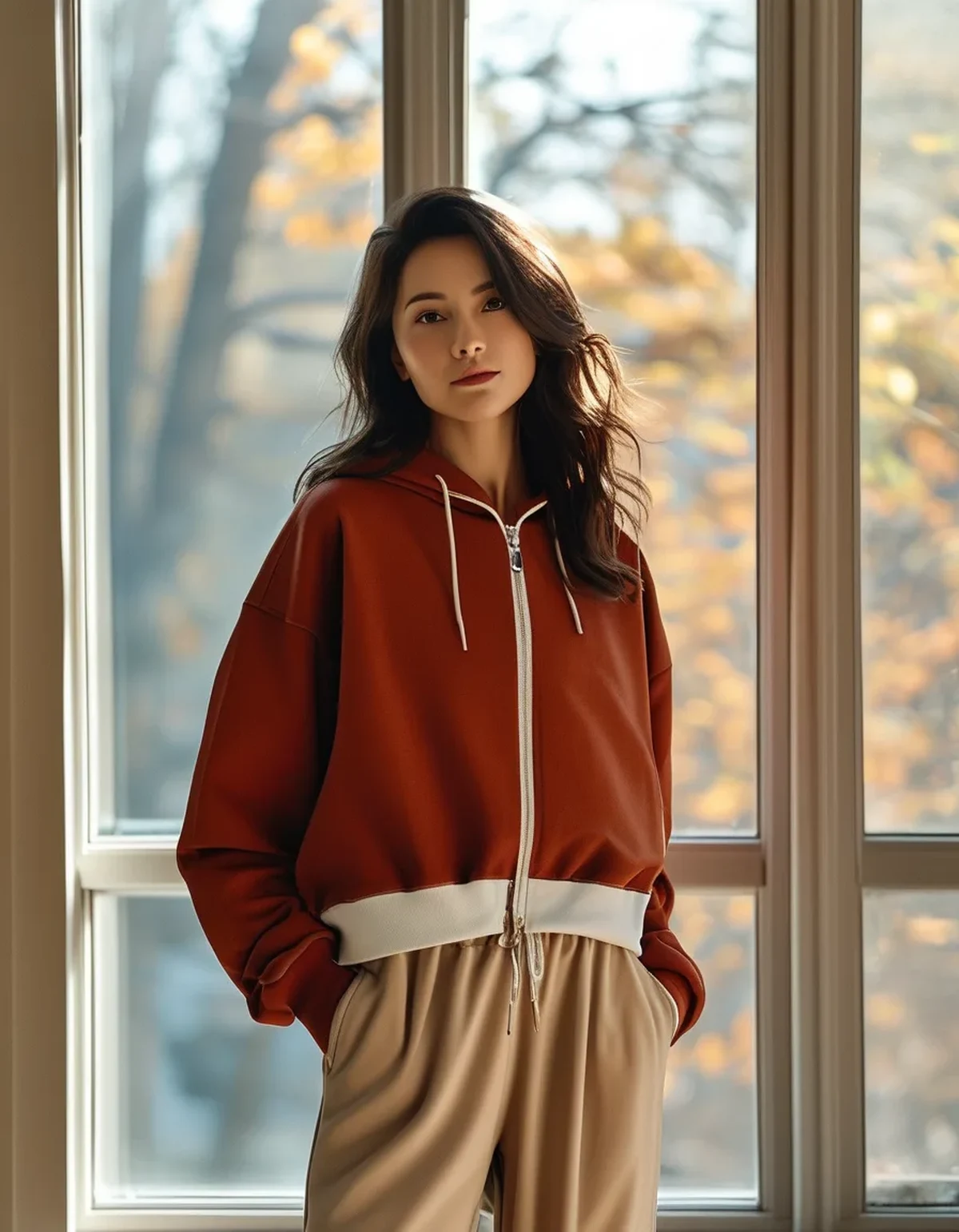
Matte fabrics absorb light; sheen fabrics return it. A brushed or peached finish - which is what most autumn activewear uses for warmth - scatters light diffusely and reads noticeably darker and flatter than a smooth finish in the same color. This is why your summer olive legging looks brighter than your winter olive legging despite being the same nominal shade.
Texture creates its own contrast. Ribbing, cable knit, and waffle textures produce micro shadows and highlights, which give a flat color visual interest that a smooth surface cannot. In low light, texture does the work that saturation used to do. This is the single most useful adjustment for the season - same color, textured fabric.
Sheen is the other lever. A satin-finish or lightly lustrous fabric picks up and returns low-angle light, which is why a small sheen element - a shell jacket, a slip skirt, a satin-finish jacket panel - lifts an otherwise flat outfit.
And the photography note: phone cameras apply automatic white balance, which actively fights the warm light that makes earth tones look good. If your outfit looks great in person and muddy in the photo, that is the camera correcting away the warmth. Locking white balance, or shooting slightly underexposed and lifting later, keeps the warmth.
A practical test: hold the garment near a window on an overcast day and then under your warmest indoor lamp. If it looks like two different colors, it is a mid-value cool-leaning tone and it will be unpredictable all season.
How do you build outfits that work in this light?
Use value contrast instead of color contrast. In dim light, the eye reads light-versus-dark far more reliably than it reads hue. A cream top with chocolate leggings works in any light. Sage with stone works in neither.
Anchor with one clearly dark and one clearly light piece. A monochrome mid-tone outfit is the exact configuration that reads flat. Adding a cream layer or a deep brown boot restores structure.
Let texture carry the interest. A ribbed knit, a cable cardigan, or a quilted vest gives a monochrome outfit dimension without introducing another color.
Put the warmest tone near your face. Low-light photographs and in-person impressions are both dominated by what is at eye level. Rust, cream, and camel near the face lift complexion; grey-green near the face in dim light does the opposite.
One saturated accent. A single higher-chroma piece - a burgundy bag, a deep teal jacket, an ochre scarf - prevents the whole outfit reading as a haze. It does not need to be bright, just clearly a color.
Consider metallic hardware as a light source. Gold-tone zips, buckles, and jewelry catch and return low light in a way silver does not in warm conditions. It is a small effect that shows up disproportionately in photos.
And revisit your capsule in November, not August. The colors you bought in bright September light will be worn in dim November light, and the ones that felt sophisticated then may need a cream layer to work now.
FAQ: Autumn Color Questions, Answered
Does this mean I should not buy sage activewear?
Not at all - it just needs pairing. Sage against cream or deep brown works beautifully; sage against stone or grey does not. The issue is monochrome mid-tone combinations, not the color itself.
Why does my activewear look different in the gym mirror than at home?
Gym lighting is typically bright, cool-toned, and overhead, which is close to the opposite of warm indoor evening light. Both readings are real. If a color needs to work in both, pick something with a clear warm undertone and enough value contrast to survive either.
Do earth tones fade faster than black?
Not inherently, but fading is more visible on mid-tone colors than on very dark or very light ones. Cold washing, inside out, and no direct sun drying slows it substantially in every color.
Should I just wear black in winter?
Black is easy and it flattens in photographs and low light in its own way - it reads as a shape rather than a garment. Deep chocolate, espresso, and dark olive give you the same practicality with far more dimension under warm light.
TL;DR:
- Autumn light is dimmer and warmer, which desaturates mid-value cool-leaning tones into grey.
- Rust, terracotta, cream, camel, and deep chocolate hold up. Sage, stone, and dusty mauve struggle.
- Build with value contrast - one clearly light piece, one clearly dark - not with more color.
- Texture and a little sheen do the work that saturation did in summer.
The palette does not need replacing. It needs one cream layer and one dark anchor, and the same pieces start reading the way they did in September.
See It in Motion
Seen here: Super High Waist Embossed Yoga Leggings with Inner Pocket — shop it on bubblelime.com
Keep Reading
This article is for general informational and styling purposes only. Fit, sizing, and product availability may vary.