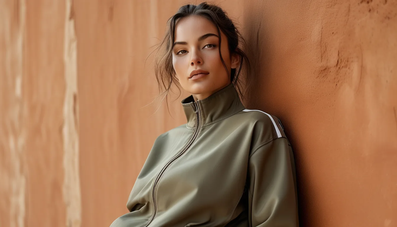
Why Earth Tones Look Different in Strong Summer Light
Quick Answer: Strong midday sun has a higher color temperature and much greater intensity than indoor lighting, which flattens muted colors and drains their depth. Earth tones with a gray base - sage, taupe, stone - lose the most. Shades with warm saturation underneath - clay, terracotta, olive, camel - hold their character outdoors. If you buy for outdoor wear, choose the warmer, more saturated end of the palette.
You loved it in the fitting room and then saw a photo from an 11am hike and wondered where the color went. The garment is fine. The lighting changed the math.
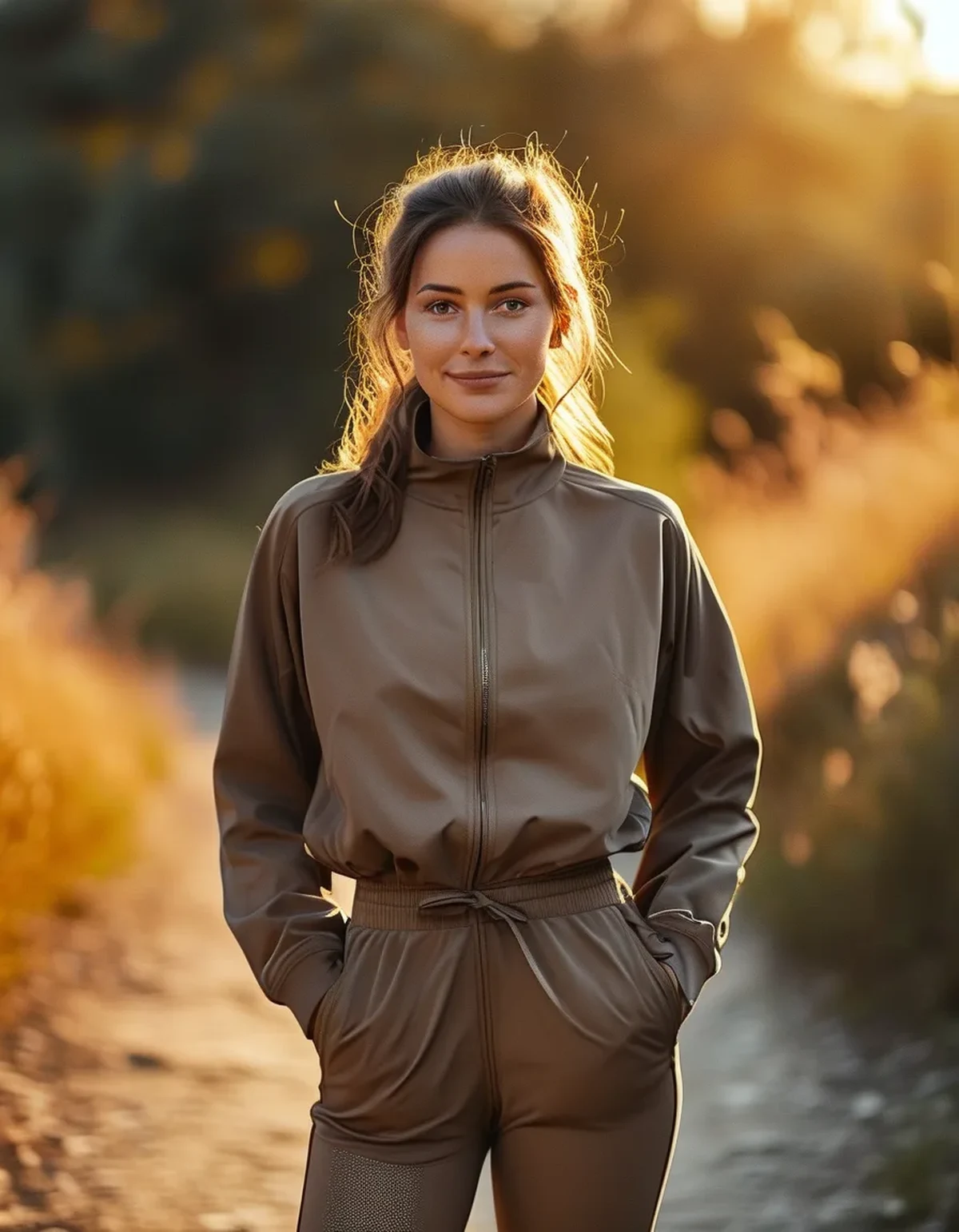
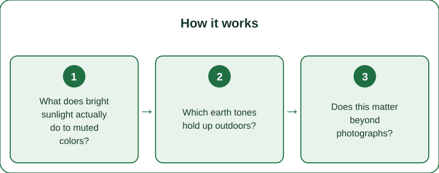
What does bright sunlight actually do to muted colors?
Two things.
Intensity. Direct midday sun is orders of magnitude brighter than indoor lighting. At high luminance, the eye and any camera compress the range, and subtle differences between low-saturation tones flatten toward a similar pale value.
Color temperature. Midday daylight sits around 5500 to 6500K - considerably cooler and bluer than the 2700 to 3000K of most indoor lighting. Warm indoor light flatters warm neutrals by adding warmth the fabric does not have. Take that away and a taupe that read cozy indoors reads gray outdoors.
Low-saturation colors have the least to lose and lose it fastest. That is the whole phenomenon.
Which earth tones hold up outdoors?
The ones with real saturation underneath the muting.
Clay and terracotta hold beautifully. There is enough orange-red pigment that intensity does not drain it.
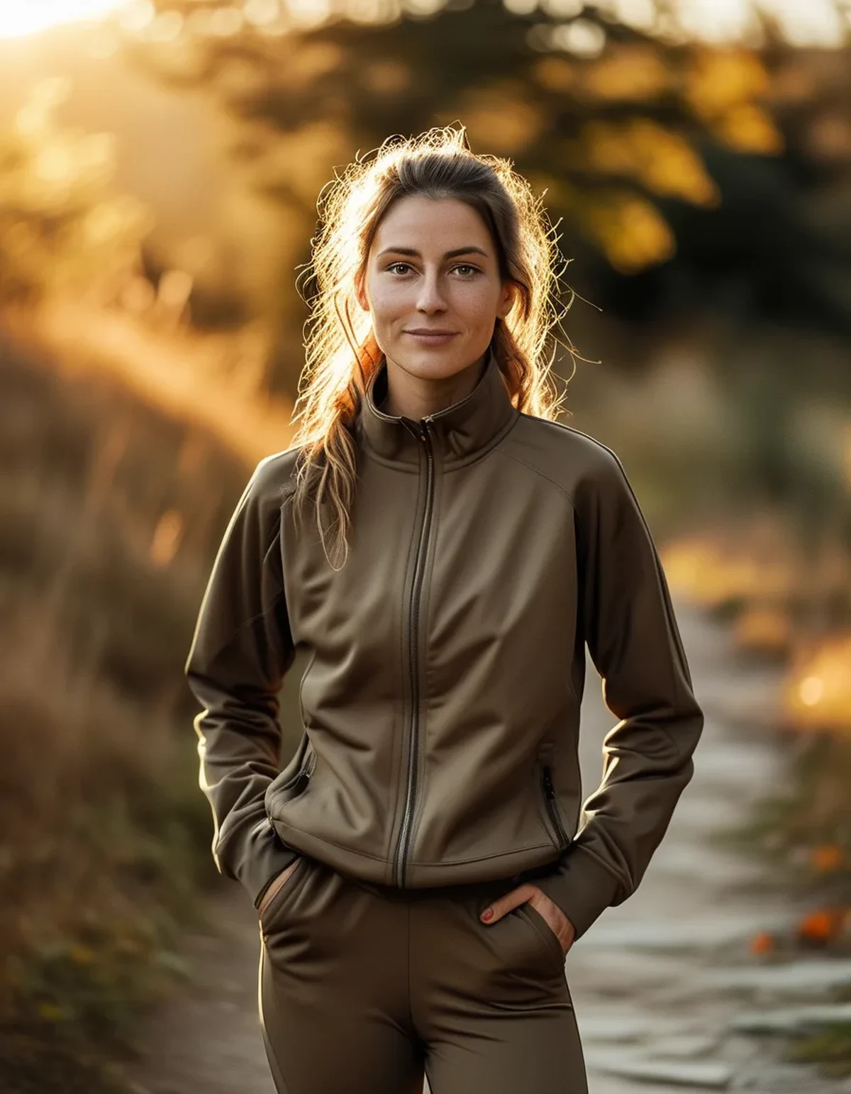
Olive and moss hold, because the yellow-green base stays legible at high brightness.
Camel and toffee hold reasonably well, especially against green surroundings.
Rust and burnt sienna are among the strongest outdoor performers in the entire neutral family.
The ones that struggle: sage, stone, greige, oat, soft taupe - all gray-based, all low-saturation, all designed to be subtle. Indoors that subtlety is the appeal. In full sun it becomes near-white.
Does this matter beyond photographs?
Yes, for two practical reasons.
Heat. Lighter, less saturated shades reflect more solar radiation and stay cooler in direct sun. So the sage that photographs poorly is genuinely more comfortable at noon than the terracotta that photographs beautifully. That is a real tradeoff rather than a rhetorical one.
Sweat visibility. Mid-tone muted colors are the worst case for visible sweat marks. Dark saturated colors hide them, very light colors hide them reasonably well, and the middle of the range shows every mark.
So the honest guidance is to choose by use. Photographing content or wearing it socially outdoors favors the saturated end. Long hot sessions in direct sun favor the light end, with the sweat-mark tradeoff accepted.
What Nobody Tells You About Building a Neutral Palette
The reason earth-tone wardrobes look coherent indoors and chaotic outdoors is undertone mixing.
Muted colors carry either a warm undertone or a cool one, and indoors the difference is nearly invisible. In bright daylight it becomes obvious - a cool-based sage next to a warm-based clay reads as a clash in a way it never does in a studio.
The fix is to pick a lane. Warm-based neutrals: clay, camel, olive, cream, rust. Cool-based neutrals: sage, stone, greige, soft charcoal. Mixing within a lane always works. Mixing across lanes works indoors and often fails in sun.
The second thing nobody mentions: fabric finish changes perceived saturation. A matte fabric holds color depth in bright light considerably better than a shiny one, because sheen adds white highlights that dilute the color.
And the third: outdoor background matters. Earth tones against green foliage read rich. The same tones against sand, concrete or dry late-summer grass can disappear into the background entirely.
FAQ: Earth Tones in Sunlight, Answered
Why does my sage set look gray in photos?
Sage is gray-based and low-saturation, so bright daylight flattens it toward gray. A warmer olive or a clay tone holds its character in the same light.
Which earth tones are best for outdoor content?
Clay, terracotta, rust, olive and camel - the saturated warm end of the palette. They stay legible at high brightness and read well against greenery.
Are darker earth tones too hot for summer?
In direct sun, darker shades absorb more radiant heat, so there is a real comfort cost. For long midday sessions, lighter shades are cooler even though they photograph less well.
TL;DR:
- Bright midday sun is more intense and cooler in color temperature, which flattens low-saturation colors.
- Gray-based tones - sage, stone, greige, taupe - lose the most; clay, terracotta, olive, camel and rust hold up.
- Light shades stay cooler in direct sun but show sweat marks worst in the mid range.
- Pick a warm or cool undertone lane - mixing across lanes shows up in daylight and not indoors.
The palette did not fail; it was designed for softer light. Choose the saturated warm end for anything you will wear or photograph outdoors, and keep the subtle grays for the studio where they belong.
Keep Reading
This article is for general informational and styling purposes only. Fit, sizing, and product availability may vary.