Can You Wear Earth Tones With Black? The Combination Rules That Actually Work
Quick Answer: Earth tones work beautifully with black, and the old rule against brown-and-black is outdated. What actually determines whether it looks intentional is contrast level and proportion: high contrast between the earth tone and the black reads as deliberate, while a near-match — dark brown against black — reads as a mistake. Navy is the harder pairing and needs a warm, clearly separated tone to work.
Most people building an earth-tone activewear wardrobe already own a lot of black. The question is not whether to replace it — it is whether the two can share an outfit.
They can, and the rule for when they cannot is simple enough to apply in front of a drawer.
Why does brown with black have a bad reputation?
It comes from menswear tailoring conventions, and it does not transfer well to activewear.
The traditional rule against brown and black together developed in a context of formal suiting, where the fabrics were matte, the colours were deep, and the two sat close enough in value that the combination looked muddy rather than deliberate. In that specific setting, the rule was reasonable.
Activewear changes every part of that. The fabrics have sheen and texture variation, the earth tone palette spans a much wider range than dark brown, and the garments are visually separated by construction lines that formal tailoring does not have.
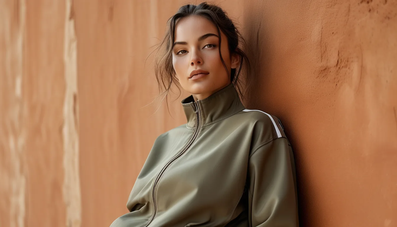
What survives from the old rule is the underlying principle: the problem is not the colour combination, it is insufficient contrast. Dark chocolate against black looks unresolved because the eye cannot tell whether you meant it. Camel against black looks obviously deliberate because nobody could mistake it for an attempted match.
So the rule to actually apply is: either clearly light or clearly dark, never almost the same. Anything within about two shades of black is the danger zone. Anything four or more shades away is safe.
Which earth tones pair best with black?
In descending order of reliability.
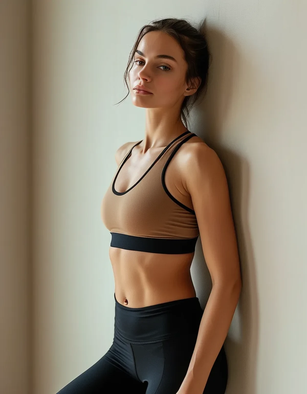
Camel and tan. The strongest pairing available. High contrast, warm against cool, and it reads as a deliberate colour story immediately. A camel sports bra with black leggings is close to foolproof.
Terracotta and rust. Excellent, with more visual energy than camel. The warmth is unmistakable against black and the saturation gives it presence. Works particularly well as the smaller proportion — a rust top with black bottoms rather than the reverse.
Olive and moss. Reliable and slightly more casual in feel. Olive against black is a classic utility combination that reads as considered rather than fashion-forward, which suits activewear.
Sand and bone. High contrast and clean. The risk here is that very pale tones show sweat and are less forgiving, which is a practical concern rather than an aesthetic one.
Deep burgundy and oxblood. Works, but sits closer to black in value, so it needs enough saturation to read as clearly red-toned rather than as faded black.
Avoid: dark chocolate, espresso, and very dark olive. These are the shades that trigger the original objection. They are beautiful with cream, camel and white, and they fight with black.
A useful test: photograph the two pieces together in black and white. If they become nearly indistinguishable in greyscale, the contrast is too low and the combination will look uncertain.

What about navy?
Navy is genuinely harder than black, and the reason is worth understanding.
Black is achromatic — it has no hue, so it does not compete with anything. Navy has a hue, and it is a cool one. Pairing a warm earth tone with navy creates a temperature clash that black avoids entirely.
That does not mean it fails. It means it needs more deliberate handling.
What works with navy: camel and tan, which are the classic navy pairings from menswear and remain reliable. Rust and burnt orange, which are opposite navy on the colour wheel and produce a genuinely striking complementary combination. Cream and bone, which are neutral enough not to fight.
What does not work with navy: olive, which shares enough blue undertone to look like an unresolved attempt at matching. Muted mauve and dusty rose, which are too close in saturation to read as intentional. And any brown with a grey undertone, which turns muddy.
The proportion rule matters more with navy. With black you can do roughly equal amounts of each. With navy, the earth tone works best as an accent — under a third of the outfit — rather than as an equal partner. A navy legging with a camel bra and a navy jacket reads well. Half navy and half olive does not.
The practical summary: if you own a lot of navy activewear and want to add earth tones, buy camel and rust, and skip olive.
How do proportions change the result?
Proportion does as much work as colour choice, and it is the part people skip.
The two-thirds rule. An outfit reads as coherent when one colour occupies roughly two thirds and the other one third. Equal halves create a visual split at the waist that is harder to make look intentional — though it works well when the contrast is very high, as with camel and black.
Which colour goes where matters. Placing the lighter earth tone on top and black on the bottom is the more conventional and generally more flattering arrangement, because it draws attention upward. Reversing it — camel leggings with a black top — is a bolder choice and needs the leggings to be genuinely opaque and well-fitting, because a light bottom half is unforgiving.
A third element resolves ambiguity. If a two-colour outfit feels uncertain, adding a third piece in one of the two colours usually fixes it — a black jacket over a camel top and black leggings creates a rhythm rather than a split.
Shoes are the tiebreaker. White trainers work with almost every earth-tone-and-black combination and are the safe default. Black trainers reinforce the black and pull the outfit cooler. Tan or brown trainers reinforce the earth tone. Choosing deliberately here is the difference between an outfit that looks assembled and one that looks accumulated.
And the seasonal note: this combination gets easier over the next six weeks. Earth tones against black read as slightly out of season in high summer and become obviously correct from early September onward, which is why the same outfit can feel wrong in July and right in a fortnight.
FAQ: Earth Tone and Black Questions, Answered
Does the fabric finish matter?
Yes, more than expected. A matte black legging with a matte camel top reads as a considered pairing. A shiny black legging with a matte camel top can look like two unrelated garments. Matching the finish is a quiet way to make an unusual colour combination look intentional.
What about black with muted pastels like sage or dusty rose?
These are the trickiest, because they are low saturation and mid-value — the exact combination that reads as uncertain against black. They work far better with cream, white or grey. If you want to wear sage with black, use it as a small accent rather than a main piece.
Is grey easier than black?
Generally yes for muted earth tones and slightly harder for saturated ones. Mid-grey sits between the extremes and gives dusty tones something to relate to. Charcoal behaves almost exactly like black.
Can I mix two earth tones together instead?
Yes, and it often looks more expensive than either with black. The rule is the same — enough value contrast to look deliberate. Camel with rust works. Camel with sand is too close unless the textures differ noticeably.
Do these rules apply to outerwear too?
The same contrast logic holds, with one addition: a jacket covers a large proportion of the outfit, so a strong earth-tone jacket effectively makes the earth tone the dominant colour regardless of what is underneath. Plan the outfit around the largest piece.
TL;DR:
- The brown-and-black rule is outdated; what matters is contrast, not combination.
- Camel, terracotta, olive and sand all work with black. Dark chocolate and espresso do not.
- Navy is harder — stick to camel and rust, keep the earth tone under a third of the outfit, and skip olive.
- Use the greyscale photo test: if the two pieces look nearly identical in black and white, the contrast is too low.
Earth tones and black are one of the most useful combinations available in activewear because almost everyone already owns half of it. Get the contrast right and the wardrobe you have doubles in usefulness.
See It in Motion
Seen here: Super High Waist Embossed Yoga Leggings with Inner Pocket — shop it on bubblelime.com
Keep Reading
This article is for general informational and styling purposes only. Fit, sizing, and product availability may vary.