Which Earth Tones Actually Hide Sweat - and Which Betray You Immediately
Quick Answer: Sweat shows most on mid-tone, flat, smooth solid colours - which is exactly where most earth tones sit. The best performers are heathered and marled fabrics, prints and textures, very dark shades, and true whites and creams. The worst are mid-tone flat solids like sage, taupe, camel, and dusty clay in a smooth fabric. Texture matters as much as darkness, and a heathered mid-tone outperforms a flat dark one in most conditions.
Earth tones dominate activewear for good reasons - they photograph well, they mix easily, and they read as considered rather than sporty. They are also, as a family, unusually bad at hiding sweat, and it is worth knowing which members of the family are the exceptions.
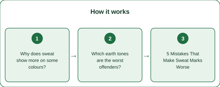
Why does sweat show more on some colours?
It is about contrast between wet and dry fabric, not about the colour itself.
Wet fabric is darker than dry fabric. Water fills the spaces between fibres, reduces light scattering, and lets more light be absorbed. Whatever the colour, the wet area gets darker and more saturated.
Contrast is what makes the patch visible. A mid-tone colour has the most room to get darker while staying clearly the same colour, so the wet patch reads as an obvious dark shape against the dry fabric. This is why mid-tones are the worst performers across every colour family.
Very dark fabric has little room to darken. Black, deep charcoal, and dark chocolate are already near the bottom of the range, so a wet patch is only slightly darker. It still shows in direct light or when the fabric goes shiny, but far less.
Very light fabric has a different mechanism. White and cream do darken, but the change is a shift towards grey rather than a jump to a strong new tone, and light fabric is often less opaque so the effect is more diffuse. Genuine white performs surprisingly well.
And texture disrupts the patch outline. A heathered or marled fabric already contains light and dark fibres mixed together, so the eye is not reading a uniform field. The wet area still darkens, but its edges blur into existing variation rather than forming a defined shape. This is why texture beats colour choice in practice, and why a heathered oatmeal outperforms a flat sage every time.
Which earth tones are the worst offenders?
The mid-tone flat solids, which is unfortunately most of the popular palette.
Worst performers:
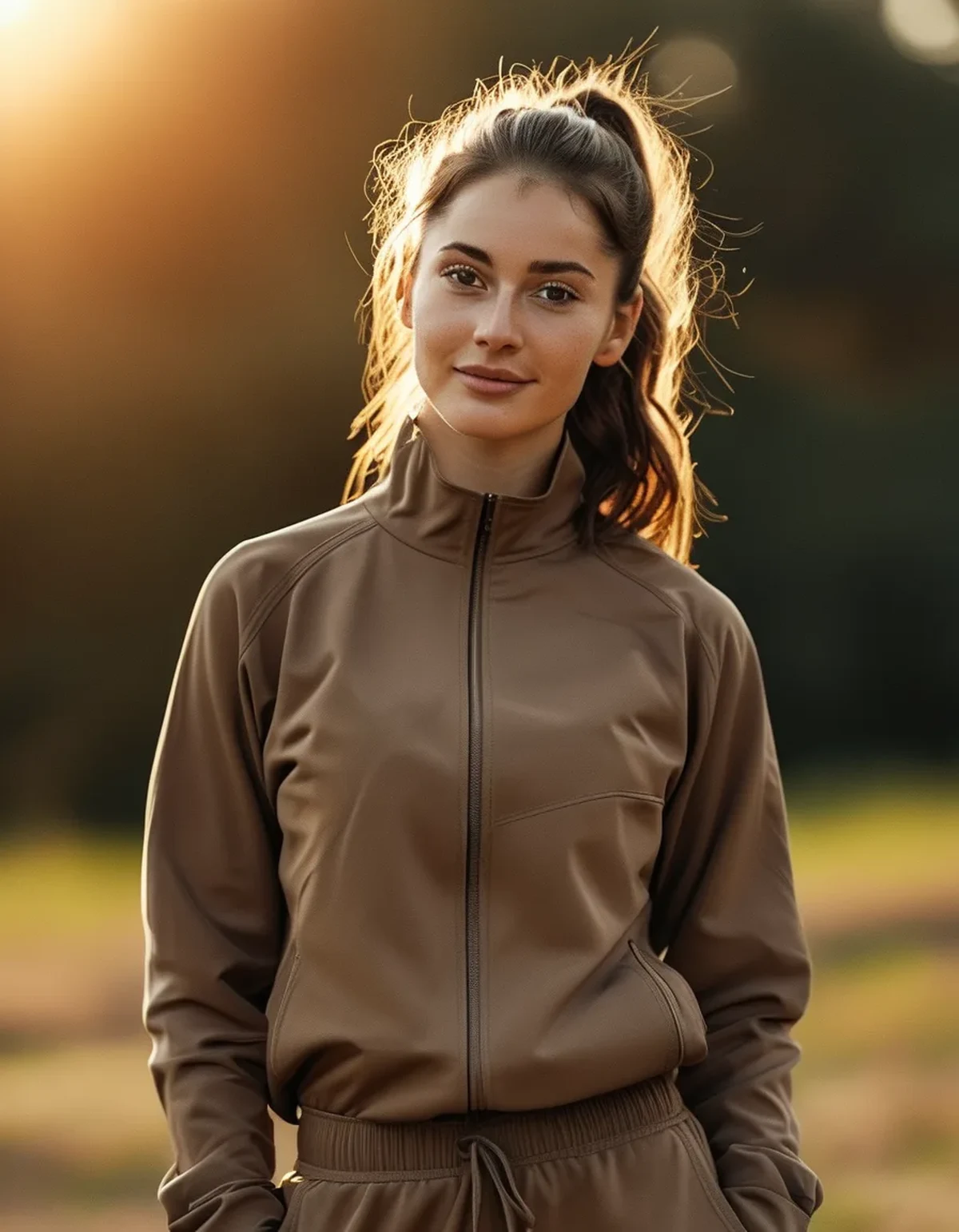
- Sage and eucalyptus. Mid-value, low saturation, usually in a smooth flat knit. Sweat produces a clearly defined dark green patch.
- Taupe and mushroom. The same problem with warmer undertones, and they tend to go noticeably grey when wet.
- Camel and warm sand. Perhaps the single worst - light enough to show a strong contrast, mid enough to darken dramatically, and usually in smooth fabric.
- Dusty clay and terracotta. Darken to a much deeper rust that reads as a different colour entirely.
- Light and mid grey. Not strictly an earth tone but frequently in the same palette, and famously the worst-performing colour in all of clothing for this reason.
Best performers within the earth palette:
- Deep chocolate and espresso. Enough depth that wet and dry are close.
- Dark olive and forest. Same principle, and it reads as an earth tone while behaving like a dark colour.
- Cream and true off-white. Counterintuitive and genuinely effective.
- Anything heathered, marled, or space-dyed in any of the above tones. A heathered taupe is dramatically better than a flat taupe.
- Prints, tie-dye, subtle camo, and textured knits like ribbing or waffle, which break up the patch outline.
And a note on the fabric itself: shiny fabrics show sweat more than matte ones regardless of colour, because wetness changes the specular reflection as well as the darkness.
5 Mistakes That Make Sweat Marks Worse
1. Judging the colour under changing room lighting. Retail lighting is bright and even, and it makes flat mid-tones look rich and dimensional. Under gym lighting or daylight, the same fabric looks flatter and shows contrast more. If you are choosing for a sweaty activity, look at it near a window.
2. Choosing a smooth fabric because it feels nicer. Buttery, smooth, flat knits feel excellent and show sweat the most, because there is no visual noise to hide behind. A slightly textured fabric that feels marginally less luxurious is the better functional choice, and this trade-off catches almost everyone.
3. Ignoring where the seams and panels sit. Colour-blocked panels can help enormously if the panel happens to sit where you sweat - down the spine, under the bust, at the lower back. A darker or textured panel in those zones is a genuine design feature, not a coincidence, and worth looking for.
4. Wearing cotton for anything sweaty. Cotton absorbs and holds moisture rather than moving it, which means the patch is bigger, darker, wetter, and stays for the rest of the session. Technical fabrics spread moisture over a larger area to evaporate faster - which paradoxically can make a lighter, wider mark rather than a small dark one, but it dries far quicker.
5. Buying a whole set in the season’s flat mid-tone. The palette that dominates each season is chosen for how it photographs, not how it performs. Buying one piece to test before committing to a set is the cheapest insurance available.
What actually works in practice?
A strategy rather than a single rule.
Match the colour to the activity, not to the outfit.
- High-sweat activities - hot yoga, spin, HIIT, summer running: dark solids, heathered anything, prints, or genuine white. Avoid flat mid-tones entirely.
- Moderate - strength training, pilates, brisk walking: heathered mid-tones are fine, flat mid-tones are risky under the arms and at the lower back.
- Low - recovery sessions, errands, travel: anything goes.
Use layering deliberately. A darker or textured base layer under a flat mid-tone top means the visible layer is not the one absorbing sweat. This is why a lot of people who look unbothered in flat colours are wearing something underneath.
Think about the specific zones. Sweat appears first and most visibly in a predictable pattern - the centre of the chest, under the bust, down the spine, the lower back where a waistband sits, and the underarms. A top with a textured or darker panel in any of those places outperforms its overall colour.
And on fabric technology: moisture-wicking fabrics move sweat to the outer surface to evaporate, which is genuinely better for comfort and drying time. It does not make the mark invisible - it can make it wider and lighter. Comfort and appearance are separate problems, and only colour and texture solve the second one.
The single most reliable purchase in this whole category is a heathered mid-tone in a matte technical fabric. It reads as an earth tone, it mixes with everything, and the marl does the hiding that the colour cannot.
FAQ: Sweat and Colour Questions, Answered
What colours hide sweat best?
Very dark solids, genuine white and cream, and any heathered, marled, or printed fabric. The worst are mid-tone flat solids - grey, sage, taupe, camel - where wet fabric contrasts most strongly with dry.
Why does grey show sweat so badly?
Mid-grey sits right in the middle of the value range, so wet fabric darkens dramatically while remaining recognisably the same colour. That maximum contrast is exactly what makes a patch visible, and grey is usually made in smooth flat fabric that adds no visual noise.
Does moisture-wicking fabric stop sweat marks?
No. It moves moisture to the surface to evaporate faster, which improves comfort and drying time but can spread the visible mark over a wider area. Appearance is determined by colour and texture, not by wicking performance.
Is black or white better for hiding sweat?
Both outperform mid-tones. Black shows very little contrast but can go shiny when wet in strong light; white shows a diffuse grey rather than a defined dark patch and is often the better choice in genuine heat, since it also absorbs less radiant heat outdoors.
TL;DR:
- Wet fabric darkens; mid-tones have the most room to darken, so they show the most.
- Sage, taupe, camel, and mid-grey in a flat smooth knit are the worst combination available.
- Deep chocolate, dark olive, cream, and anything heathered are the earth-tone winners.
- Texture beats darkness - a heathered mid-tone outperforms a flat dark solid.
- Wicking fabric helps comfort and drying, not appearance. Those are different problems.
The season’s palette was chosen for how it looks in a photograph taken before the workout. Buy one piece and test it before committing to the set.
Keep Reading
This article is for general informational and styling purposes only. Fit, sizing, and product availability may vary.