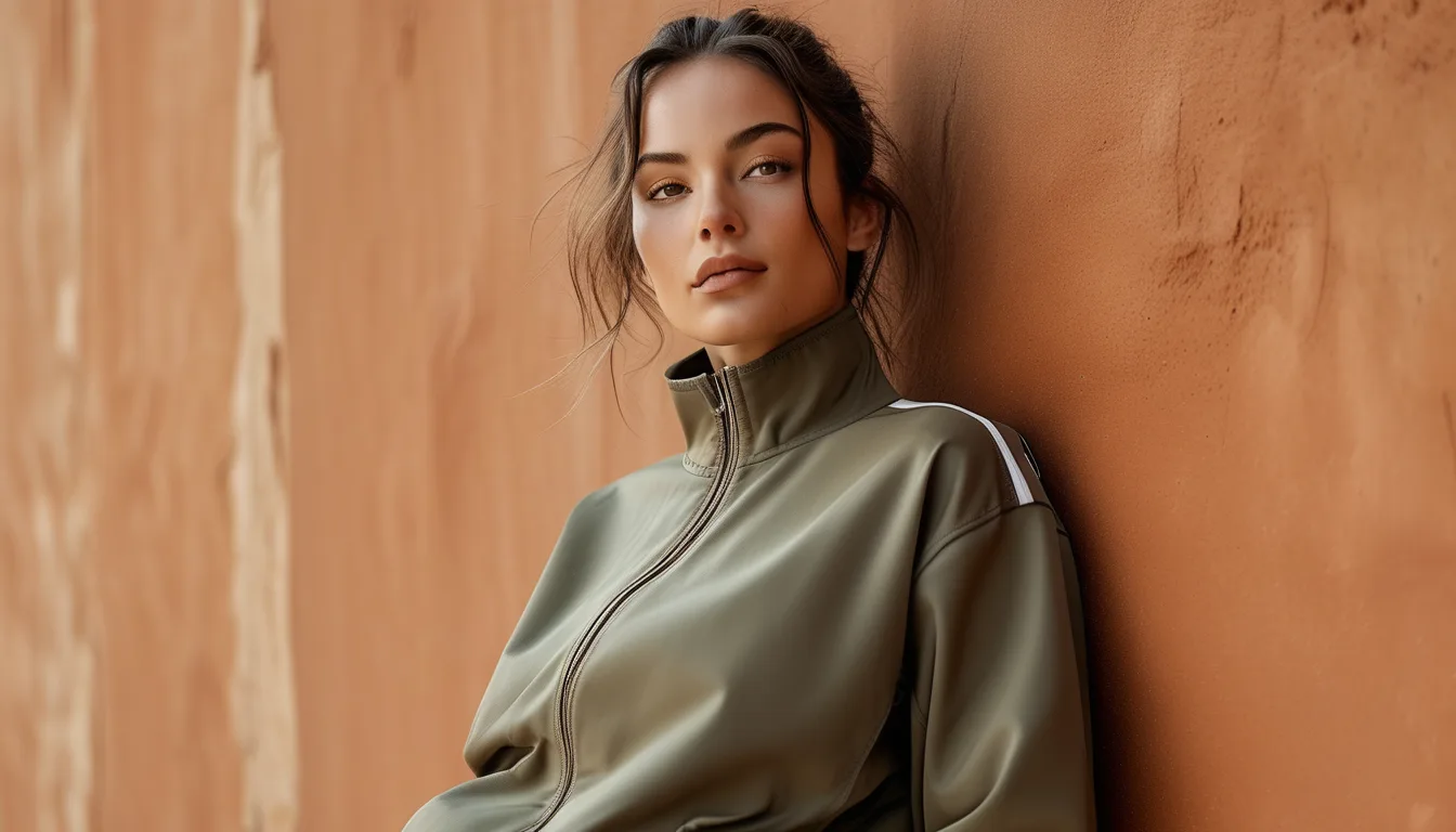
Building an Earth Tone Activewear Wardrobe in the Right Order
Quick Answer: Buy the darkest bottom first, then the mid-tone top, then the outer layer, then accents. Olive, chocolate, and warm taupe are the three earth tones that pair with the widest range of other colours, and any two of them work together. The mistake is buying the interesting colours - rust, terracotta, ochre - before the foundational ones, which produces a drawer of pieces that only work with themselves.
The earth tone palette photographs beautifully and is very easy to buy wrong.
The order you buy in determines whether you end up with a wardrobe or a collection.
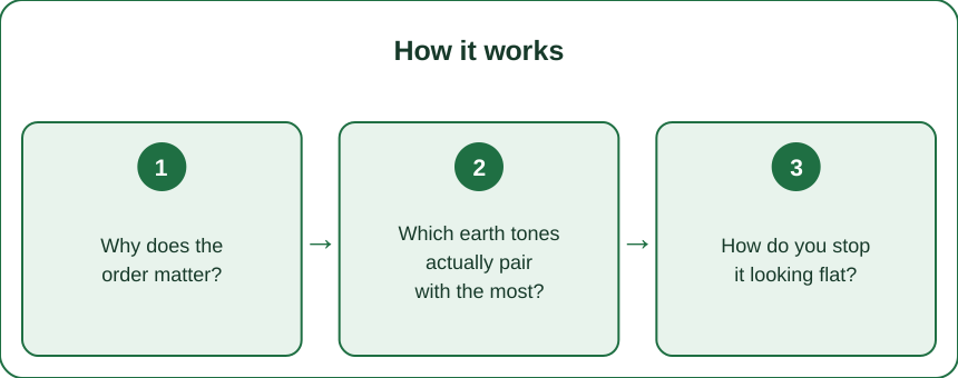
Why does the order matter?
Because the foundational pieces determine how many outfits each subsequent purchase creates.
A wardrobe’s usefulness is combinatorial. A piece that pairs with five things you own creates five outfits. A piece that pairs with one creates one.
Which means the same purchase has completely different value depending on what you already have. A rust top bought first pairs with nothing. Bought fourth, it pairs with three bottoms and two layers.
Bottoms come first because they are worn more repeatedly. Most people wear a bottom multiple times per top rotation, so the bottom is doing more work and warrants the more versatile colour.
Darker comes before lighter for practical reasons too. Darker bottoms show less, wear better, and pair with a wider range of tops. A light taupe legging is lovely and considerably more restrictive.
The general sequence:
- Dark neutral bottom - chocolate, deep olive, or espresso
- Mid-tone top - taupe, clay, or warm grey
- Outer layer in a warm neutral - cream, camel, or olive
- Second bottom in a different dark neutral
- Accent colour - now that everything else can host it
Why this works: by step three you have several complete outfits. By step five, an accent piece multiplies across everything rather than sitting alone.
The common failure pattern: buying the visually exciting piece first, then buying a second piece to go with it, then a third - ending up with three separate outfits rather than a system.
Which earth tones actually pair with the most?
Three do most of the work, and they all pair with each other.
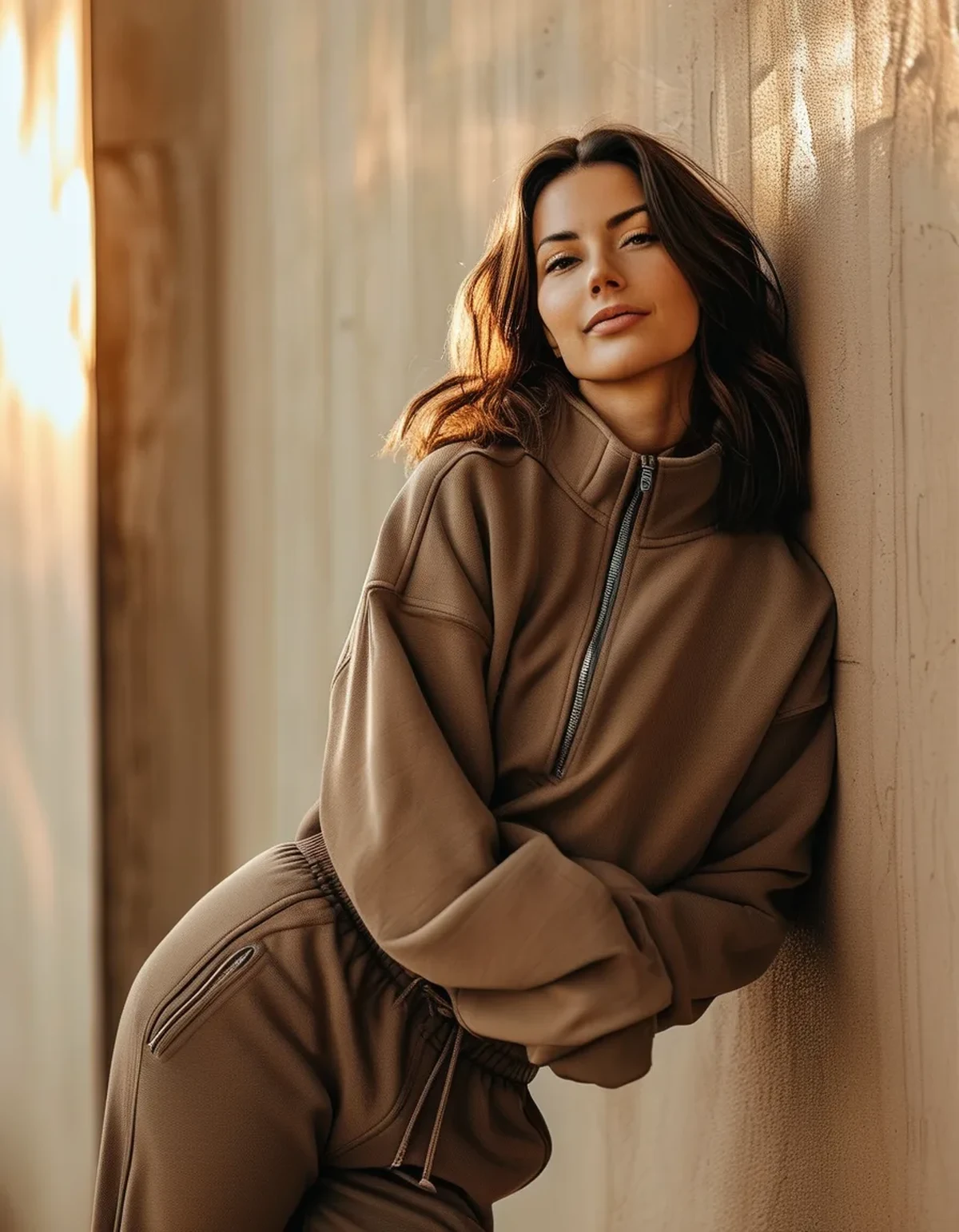
Olive. Functionally a neutral in practice. It pairs with cream, chocolate, rust, black, white and most blues, and it works across all four seasons. If you buy only one earth tone, this is the most useful.
Chocolate and espresso. The warm alternative to black, and increasingly common in activewear. It softens against most skin tones, photographs better than black, and pairs with cream, camel, rust, olive and pink. It also hides wear well, which matters on a bottom.
Warm taupe and clay. The mid-tone connector. They sit between the darks and the lights and bridge outfits that would otherwise not work - and they are the most useful colour for a top, because they read as a neutral against any bottom.
The second tier, worth having once the first three are covered:
- Cream - the most useful light neutral in activewear and consistently underused
- Camel - excellent as an outer layer, less good as a bottom
- Rust and terracotta - the accent that earns its place; strong in autumn and fine in summer
- Ochre and mustard - more limited, and striking when it works
What to be cautious about: very light earth tones as bottoms - beige and sand leggings show everything and are sheer more often than dark ones at the same fabric weight. Sage green, which reads more as a trend colour than a true neutral and dates faster than olive.
On skin tone: the useful distinction is between warmer and cooler earth tones rather than between suits-you and does-not. A cooler-toned taupe versus a warmer clay is the adjustment worth making, and both exist in most ranges.
How do you stop it looking flat?
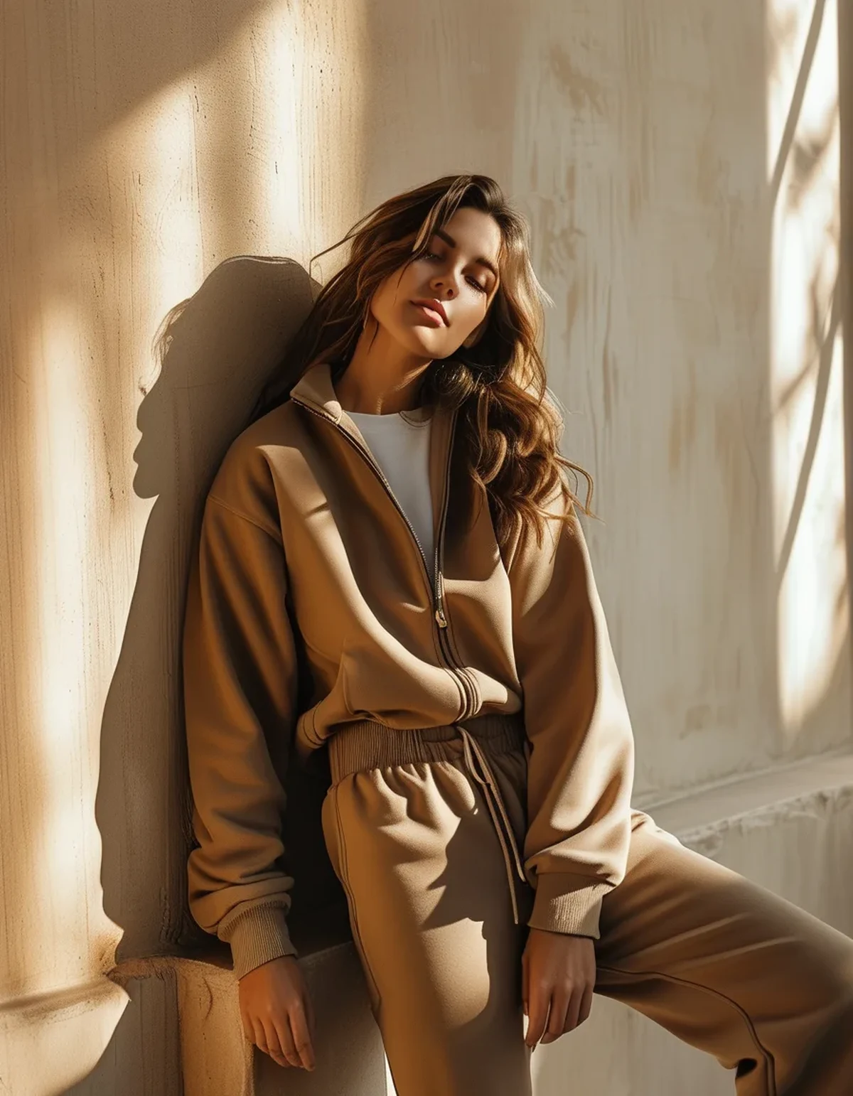
The most common criticism of the palette, and it is a texture problem rather than a colour one.
Earth tones are low in contrast with each other by definition. An outfit in three similar mid-tones can read as undefined, particularly in flat autumn light.
Three fixes, in order of effectiveness:
1. Vary the texture. A ribbed legging with a smooth top, or a matte bottom with a slight-sheen jacket. Texture creates the visual separation that colour contrast would otherwise provide - and it is the single most effective fix.
2. Include one genuinely dark piece. An outfit anchored by a dark chocolate or deep olive has structure. Three mid-tones together is what looks flat, and one dark element fixes it immediately.
3. Vary the tonal depth deliberately. Light top, dark bottom, mid layer creates a gradient. Same-depth-everything is where the flatness comes from.
A fourth option: one small point of contrast. A white trainer, a black strap, a metallic detail. It does not need to be a colour - a change in value or finish is enough.
What not to do: add a bright colour to fix flatness. It usually fights the palette rather than lifting it, and the result reads as an earth tone outfit with something wrong with it. The exception is a deeply saturated version of an earth tone - a strong rust or a deep burgundy - which sits within the family while adding intensity.
On photographing well: earth tones photograph unusually well in natural light, particularly the warm lower light of autumn. They photograph less well under fluorescent gym lighting, which flattens and cools them. That gap is why the palette looks better on a walk than in a gym mirror - the lighting, not the clothes.
What Nobody Tells You About Earth Tone Activewear
Five things worth knowing before building the wardrobe.
Dye lots vary more in earth tones than in primaries. Two olive pieces from the same brand in different seasons can be visibly different shades. Buying a matched set at the same time is more important here than in a black wardrobe, where any black matches any other.
Light earth tones show sweat more than any other colour. Sand, beige and light taupe show sweat marks far more visibly than black or dark olive, and more than mid-tones. For high-sweat training, keep the lights for the top layer or for lower-intensity activity.
Brown activewear was rare until recently, which is why it looks current. Black and grey dominated the category for years. That novelty is doing some of the work - it will normalise, and the colours will remain good.
Earth tones hide wear better than black. Black fades to grey visibly and unevenly. Olive and chocolate age more gracefully because the fade is less contrasting, which genuinely extends how long pieces look acceptable.
The palette is much more forgiving of mixing brands. Two blacks from different brands often clash subtly. Two olives read as intentional tonal variation even when they do not match exactly - which makes it a practical palette to build gradually rather than all at once.
FAQ: Earth Tone Activewear Questions, Answered
What is the single best first purchase?
A dark olive or chocolate legging. It pairs with the widest range of tops, hides wear well, and works across every season. It is the piece everything else is built around.
Do earth tones work in summer?
Yes - olive, clay and rust all work in bright light, particularly in lighter fabric weights. Very dark chocolate can feel heavy in peak summer, which is where the mid-tones do their best work.
How do I stop an all-earth-tone outfit looking flat?
Vary texture rather than adding colour, and include one genuinely dark piece to anchor it. Three similar mid-tones together is the specific combination that reads as flat.
Will these colours date?
Olive, chocolate and taupe are stable neutrals with long histories in clothing. Trend-driven shades like sage green move faster. Building the foundation from the stable three and treating the rest as accents handles it.
Do earth tones show sweat more than black?
Light ones do, considerably - sand and beige are the worst offenders. Dark olive and chocolate are comparable to black. Keep the lights for lower-intensity activity or for outer layers.
Can I mix earth tones with black?
Yes, and chocolate with black can look slightly muddy in low light. Olive and rust both work well with black. If the combination looks off, it is usually two warm-versus-cool tones fighting rather than the pairing itself.
TL;DR:
- Buy in order: dark neutral bottom, mid-tone top, warm neutral layer, second bottom, then accents
- Olive, chocolate and warm taupe pair with the most and with each other
- Cream is the most underused useful light neutral in activewear
- Flatness is a texture problem - vary texture and anchor with one genuinely dark piece rather than adding a bright colour
- Light earth tones show sweat far more than black; dark olive and chocolate do not
- Dye lots vary between seasons, so buy matched sets together
Buy the boring one first. It is what makes the interesting one worth owning.
See It in Motion
Seen here: Super High Waist Embossed Yoga Leggings with Inner Pocket — shop it on bubblelime.com
Keep Reading
This article is for general informational and styling purposes only. Fit, sizing, and product availability may vary.