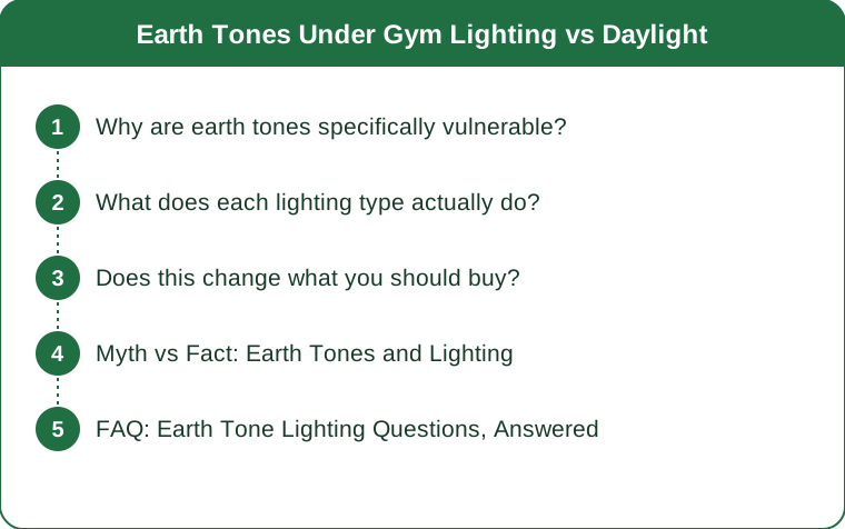
Earth Tones Under Gym Lighting vs Daylight
Quick Answer: Earth tones are low-saturation colors that depend on subtle undertone differences, which makes them unusually vulnerable to poor light. Gym LEDs typically have a high blue component and a low color rendering index, which drains warmth from rust, terracotta, and olive and pushes them toward grey or green. Daylight or warm-white light restores them. If you are choosing colors for photos or for how you feel, check them near a window.
Brights survive bad lighting. Earth tones do not.
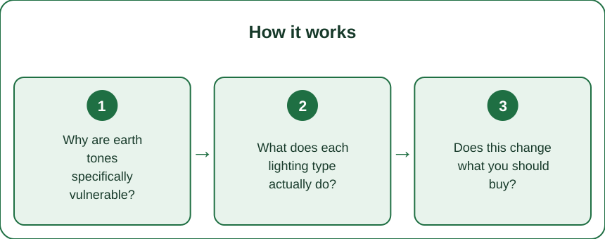
Why are earth tones specifically vulnerable?
Because their identity lives in a narrow band of the spectrum, and bad lighting removes exactly that band.
A saturated color - a true red, a bright cobalt - reflects strongly across a wide portion of its wavelength range. It reads as itself under almost any light because there is so much signal.
Earth tones are desaturated and heavily dependent on undertone. Terracotta is a red with a specific amount of yellow and grey. Olive is a green with yellow and brown. Sand is a near-neutral distinguished only by a slight warm bias. The difference between a beautiful clay and a muddy brown is a few percentage points of reflectance in specific wavelengths.
A light source that does not emit strongly in those wavelengths cannot make the fabric reflect them. If the light contains little in the red-orange band, a terracotta legging simply cannot look terracotta - there is nothing there to reflect.
This is measured by the color rendering index (CRI), a 0 to 100 score of how faithfully a light source reveals color compared to natural light. Daylight is 100 by definition. Good indoor LEDs run 90+. Cheap high-output commercial LEDs - exactly what most gyms install - frequently run 70 to 80, with a notable dip in the red region.
That dip is the whole problem.
What does each lighting type actually do?
Daylight, indirect (near a window, no direct sun). The honest reference. Full spectrum, CRI 100. Earth tones look their best and their truest here.
Direct sunlight. Very bright and slightly blue at midday, warmer at golden hour. Tends to wash out desaturated colors by sheer intensity, but golden hour is exceptionally flattering to warm earth tones because the light itself is shifted toward red-orange.
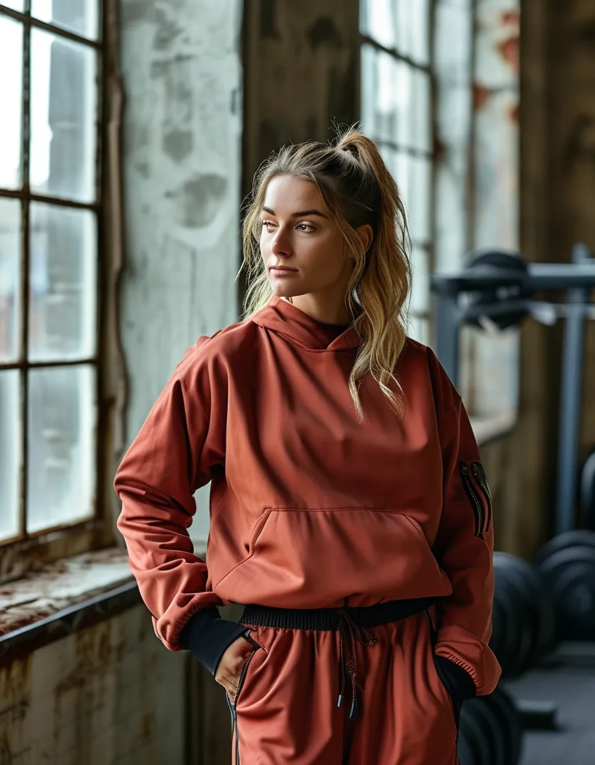
Cool white gym LED (5000-6500K, low CRI). The worst case. Blue-shifted with a red deficiency. Rust flattens toward brown-grey, olive shifts toward a slightly institutional green, and warm sand reads as beige-grey. Skin tones look worse too, which compounds the impression.
Warm white LED or incandescent (2700-3000K). Very flattering to earth tones - the light is already shifted toward the wavelengths these colors depend on. Rust glows, cream warms up. The tradeoff is that cool colors look dull.
Changing room lighting. Usually deliberately warm and diffuse, because it is designed to flatter. Which is precisely why the color you fell in love with in the changing room is not the color you see on the gym floor thirty feet away.
The practical rule that follows: judge earth tones near a window, always. Not under store lighting, not in a changing room, and not in a gym.
Does this change what you should buy?
It changes what you should buy for a given context, which is a more useful framing than good or bad colors.
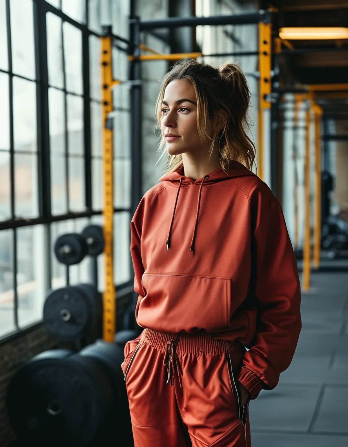
For a gym you train at regularly with cool LED lighting: earth tones will underperform there, permanently. If how you look in the gym mirror affects how you feel training, this is a real consideration. Colors that survive low CRI light are higher-saturation ones - a true navy, a clear burgundy, a deep forest - and true blacks and charcoals, which have no undertone to lose.
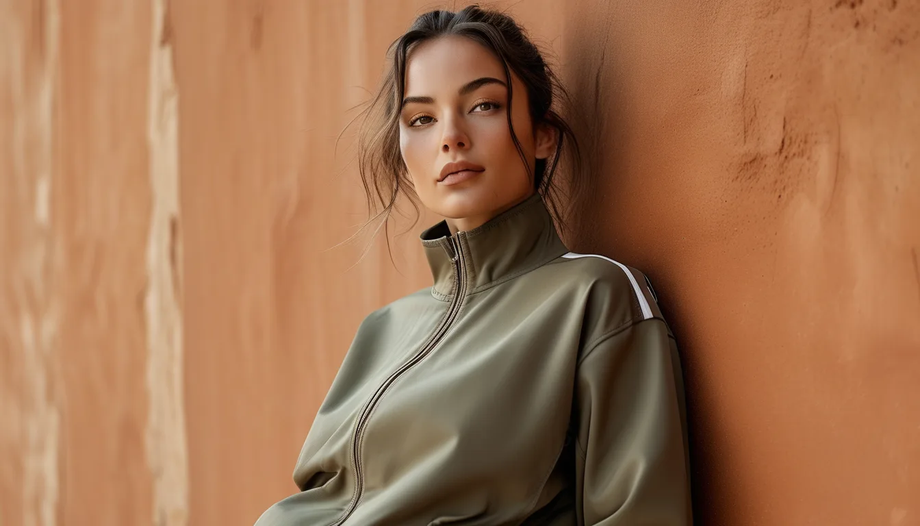
For outdoor training, walking, or content: earth tones are excellent and this is where they belong. Natural light is their best case, and they harmonize with outdoor environments in a way brights do not.
For photos: depends entirely on where. Outdoors, earth tones photograph beautifully, particularly in the hour before sunset. Indoors under mixed lighting, they are the hardest colors to photograph well and typically need white balance correction.
For everyday wear: they are a strong choice because most of daily life happens in mixed and natural light.
One more practical note as the season shifts: autumn daylight is naturally warmer and lower-angled than summer daylight, which flatters earth tones considerably. Colors that felt slightly flat in harsh July midday sun often look noticeably richer in September and October light. That is a real effect and not just seasonal association.
Myth vs Fact: Earth Tones and Lighting
Myth: If a color looks bad in the gym, it is a bad color.
Fact: It is a color-and-light mismatch. The same piece near a window may look excellent. Judge the color in the environment where you will mostly wear it.
Myth: Expensive activewear holds color better under bad lighting.
Fact: Dye quality affects fade resistance and color depth, but no dye can reflect wavelengths the light source is not emitting. A premium terracotta under 75 CRI light looks about as flat as a cheap one.
Myth: Phone cameras show you what the color really looks like.
Fact: Phone cameras apply automatic white balance, which actively compensates for the lighting - often making a color look better in the photo than to your eye. This is why pieces sometimes look different in person than in your own photos of them.
Myth: Two earth tones from the same brand will coordinate.
Fact: Only if they were designed as a collection. Two warm-based earth tones coordinate; a warm-based rust and a cool-based sage clash in a way that is subtle and hard to name. Check undertones by holding pieces against a white surface in daylight - the warm or cool bias becomes obvious immediately.
FAQ: Earth Tone Lighting Questions, Answered
How can I tell a gym’s lighting quality without measuring it?
Look at how skin tones read in the mirror. If everyone looks slightly grey or greenish, the CRI is low. Another quick tell is whether reds in the room - equipment, signage - look vivid or muddy.
What is the most reliable earth tone across lighting conditions?
Deeper, more saturated versions hold up best - a deep rust rather than a pale clay, a dark olive rather than a light sage. The paler and more desaturated the color, the more it depends on good light.
Should I match my activewear to my skin undertone?
It genuinely helps, and the same lighting principle applies - hold the fabric near your face at a window, not under store lighting. Warm-undertone skin tends to be flattered by rust, camel, and olive; cool-undertone skin by clay-pinks, taupe, and cooler greens.
TL;DR:
- Earth tones are desaturated and undertone-dependent, so they need good-spectrum light to read correctly.
- Gym LEDs often run 70 to 80 CRI with a red deficiency, which drains warmth and pushes rust toward grey and olive toward institutional green.
- Judge earth tones near a window - never under store, changing room, or gym lighting.
- For low-CRI gym environments, saturated colors and true blacks perform better; earth tones belong outdoors and in daily life.
- Phone cameras auto-correct white balance, so photos are not a reliable check.
Autumn daylight is warmer and lower-angled than summer sun, which is genuinely the best light these colors will see all year.
Keep Reading
This article is for general informational and styling purposes only. Fit, sizing, and product availability may vary.