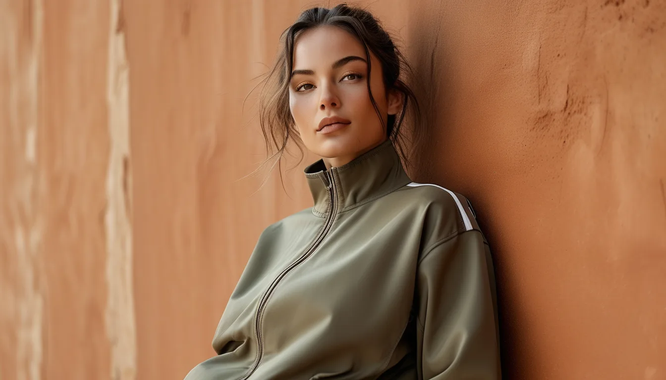
Why Earth-Tone Activewear Photographs Better for Fitness Content
Quick Answer: Earth tones like clay, olive, and sand photograph more accurately than neon because they sit in a mid-saturation range that camera sensors render true-to-life, while neon’s extreme saturation gets clipped or shifted under both sunlight and artificial gym lighting. Warm, muted tones also reflect light more evenly across different skin tones, which is why they read as flattering instead of competing with the wearer’s face.
If you’ve ever posted a workout video in a neon-green set that looked incredible in person and washed-out or oddly orange on camera, you’re not imagining it. It’s not your lighting setup or your phone — it’s the color itself fighting the way cameras capture saturation. Earth tones don’t have that problem, and once you understand why, you’ll never look at your content the same way again.
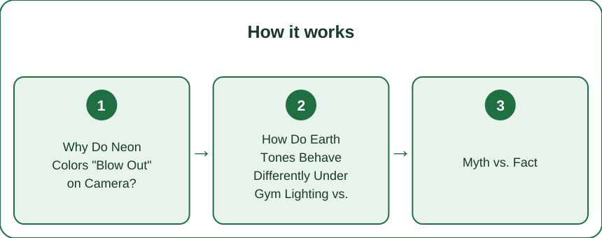
Why Do Neon Colors “Blow Out” on Camera?
Every camera sensor, from a $3,000 mirrorless body to your iPhone, has a limited dynamic range for capturing saturation. Neon colors — the acid greens, electric pinks, and traffic-cone oranges — sit at the extreme edge of the visible saturation spectrum. When light hits fabric dyed that intensely, it reflects a very narrow, very intense band of wavelengths back into the lens.
The sensor tries to record that intensity, but once a color channel (red, green, or blue) hits its max value, it “clips.” The result is a flat, plasticky patch of color with no texture or shadow detail — you lose the fabric’s actual weave, the way it drapes over your body, even the shading that shows muscle definition. This is why neon leggings often look like a cutout pasted onto the photo rather than something a person is actually wearing.
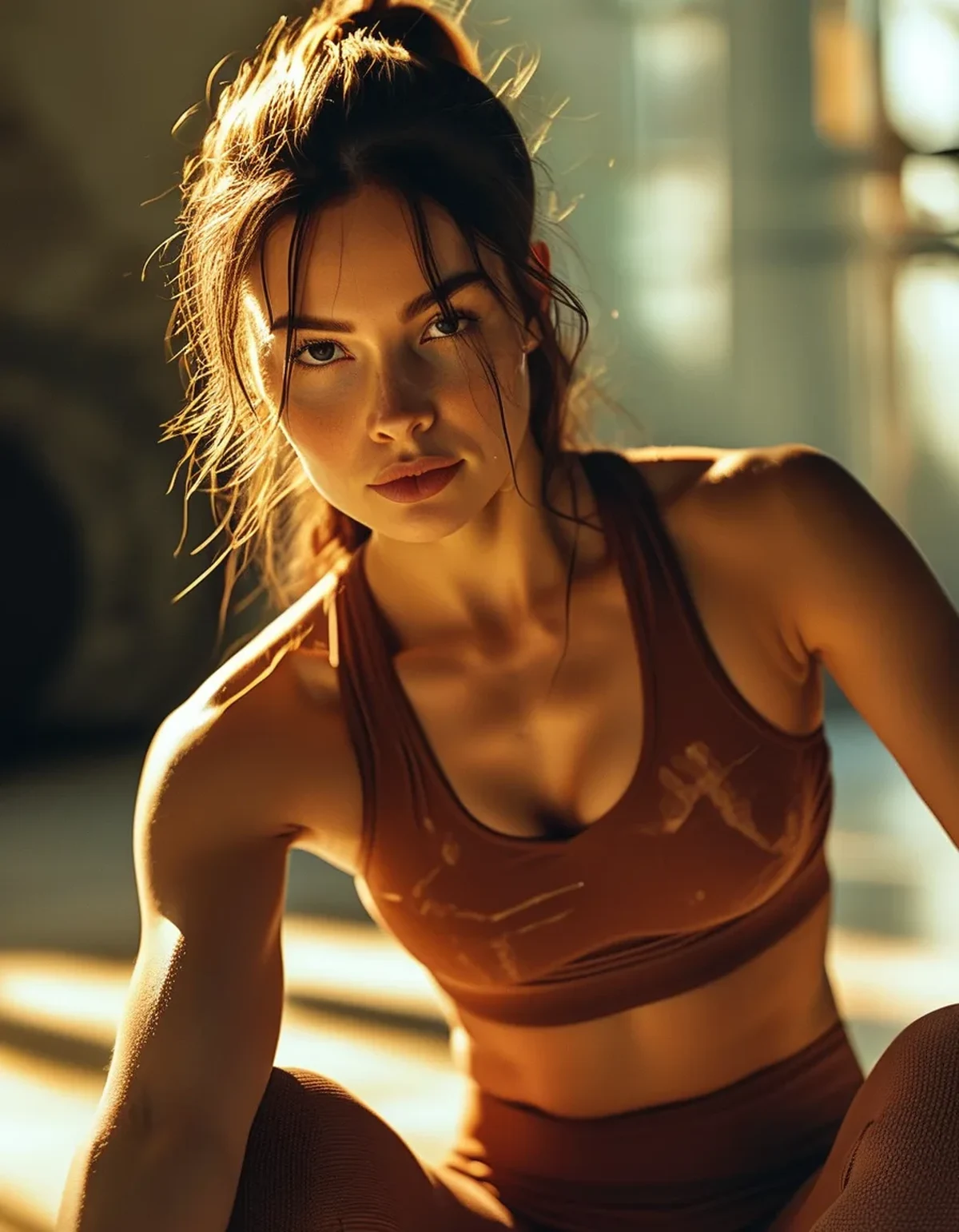
Earth tones avoid this entirely. Clay, olive, sand, and terracotta sit in the mid-saturation range — roughly 40-60% saturation compared to neon’s 90-100%. That gives the sensor room to record gradation: the slightly darker fabric in a fold, the lighter highlight where light hits your hip, the texture of a ribbed knit. Your camera can actually “see” the garment instead of just registering a color block, which is the difference between a photo that looks professional and one that looks like a screenshot.
This matters most for video, where compression makes the clipping problem worse — most phones and social platforms compress saturated color data more aggressively than mid-tones, so neon fabric can develop banding or color noise that isn’t visible in a still photo.
How Do Earth Tones Behave Differently Under Gym Lighting vs. Daylight?
Gyms are lit almost exclusively with fluorescent or LED fixtures, both of which have a color temperature that leans cool (5000-6500K) and a spiky, incomplete light spectrum — meaning they don’t emit light evenly across all wavelengths the way sunlight does. This is why gym photos often have a slight blue or green cast even when nothing looks obviously “off” to your eye standing there.
Bright, saturated colors are far more sensitive to this shift because they only reflect a narrow wavelength band to begin with. A hot pink under warm daylight might photograph as coral-pink; under cool gym LEDs, the same pink can shift toward magenta or even look slightly purple. Your camera’s white balance is trying to correct for the overall color cast, and narrow-band colors get dragged along with that correction in unpredictable ways.
Earth tones are built from broader wavelength mixes — olive is a green-yellow-brown blend, clay is a red-orange-brown blend — so they have more “anchors” across the spectrum. When gym lighting shifts cool, an earth tone might read slightly cooler too, but it stays recognizably itself. A clay legging under LED light still reads as some shade of clay or rust; it doesn’t jump to a completely different hue family the way neon can.
This is also why earth-tone content transitions so much better between locations. If you’re filming a set that starts outdoors and moves into a gym, neon pieces can look like two different colors in the two clips. Earth tones stay consistent enough that the footage cuts together believably.
Myth vs. Fact: Do Warm Tones Really Flatter More Skin Tones?
Myth: “Flattering” colors are just a subjective styling preference, not something measurable.
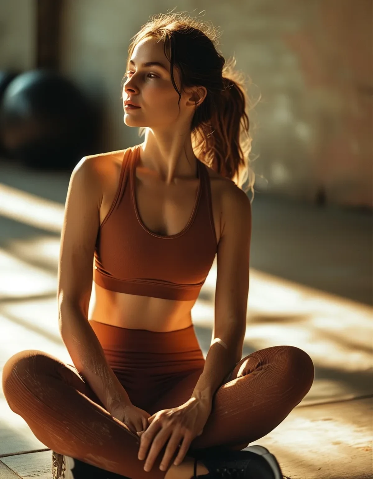
Fact: There’s an actual optical mechanism here, and it’s about contrast and reflected light, not personal taste. When a warm-toned fabric sits close to your face or torso, it reflects warm light upward onto your skin — this is the same principle photographers use when they bounce a gold reflector under a subject’s face to add warmth and reduce harsh shadows.
Because clay, olive, and sand contain red-orange-yellow undertones, they reflect that warmth onto skin regardless of whether your own undertone is warm, cool, or neutral. Neon and stark brights don’t do this — a highly saturated cool-toned color (electric blue, acid green) reflects almost no complementary warmth, and can actually cast a slight color tint onto nearby skin that reads as a shadow or dullness on camera, even on skin tones that “cool” colors are supposedly suited for.
This doesn’t mean brights are universally unflattering in person. It means they photograph less forgivingly. In real life your eyes and brain constantly correct for color casts (a phenomenon called chromatic adaptation) — you don’t notice a green tint on your own face because your brain filters it out in real time. Cameras don’t have that correction. What the lens captures is what stays.
The practical result: earth tones tend to make skin look evenly lit and warm in photos across a wider range of skin tones than saturated brights do, which is exactly why they’ve become a staple in fitness content that’s shot for feed and reel use rather than just worn to the gym.
What Nobody Tells You About Editing Neon vs. Earth-Tone Footage
Here’s the part most people find out the hard way: neon activewear is significantly harder to color-grade after the fact. Because clipped color channels lose their data, you genuinely cannot recover shadow or texture detail in a blown-out neon patch during editing — the information simply isn’t there in the file. You can darken it, but you can’t add back the gradation, so it just looks like a dimmer flat block instead of a naturally shaded piece of clothing.
Earth tones, because they never clip in the first place, retain their tonal range through editing. You can adjust exposure, warmth, or contrast on a clay-colored set and the fabric still looks like fabric — you’re not fighting a flat color block.
There’s also a batch-content angle worth knowing if you post regularly: neon pieces need individual white balance correction almost every time because they’re so sensitive to whatever light source you’re in that day. Earth tones are far more forgiving — a batch of clips shot in mixed lighting (partly outdoor, partly gym) can usually be color-matched with one global adjustment because the tones don’t swing hue families the way brights do. If you’re producing content on any kind of schedule, that alone is hours saved per week.
FAQ: Earth-Tone Activewear Photography Questions, Answered
Does this mean I should never wear bright colors for workout content?
No — brights can work great for high-energy, short-form content where a punchy, graphic look is the goal. The point is that they require more lighting control (even, diffused light, ideally daylight) and more editing effort to look accurate. Earth tones are simply more forgiving across inconsistent lighting conditions, which matters if you’re shooting quickly or in a gym you don’t control.
Which earth tones photograph best specifically?
Clay and terracotta tend to photograph the most consistently warm and true-to-life across lighting types. Olive can shift slightly more depending on whether the light leans warm or cool, but stays within the green-brown family rather than jumping hues. Sand and taupe are the most neutral and hold up well even in mixed or dim lighting.
Is this just about lighting, or does the fabric type matter too?
Fabric finish plays a role too — a matte, brushed fabric diffuses light more evenly than a glossy, compressive one, which reduces harsh reflective highlights regardless of color. But color saturation is the bigger factor in whether you get accurate reproduction versus clipping.
Will earth tones photograph well on a phone camera, or do I need a real camera?
Earth tones actually help phone cameras more than they help professional cameras, because phone sensors have a smaller dynamic range and clip saturated colors even faster. If you’re shooting primarily on a phone, sticking to mid-saturation tones is one of the simplest ways to improve photo quality without buying new equipment.
TL;DR:
- Neon colors sit at extreme saturation and “clip” on camera sensors, losing texture and shading — earth tones sit in a mid-saturation range that sensors can render accurately.
- Gym LED lighting shifts colors cool; narrow-band bright colors shift hue noticeably, while earth tones’ broader wavelength mix keeps them recognizable.
- Warm earth tones bounce warm light onto skin the way a photography reflector does, evening out skin tone across the frame — brights don’t offer that effect.
- Earth tones hold their tonal detail through color-grading and edit far more forgivingly than clipped neon footage.
If your workout photos never quite look like what you saw in the mirror, the fix might not be your lighting setup — it might be your color choice.
See It in Motion
Seen here: High Waist Yoga Leggings with Inner Pocket — shop it on bubblelime.com
Keep Reading
This article is for general informational and styling purposes only. Fit, sizing, and product availability may vary.